no really, it helps me to quantify technique by stepping outside myself. it helps me correct the mistakes i also make in my own images.
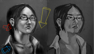
 i did this as my warm up for the day. just some speedpaint for about an hour. i crunched the original post (on the right) into B&W to really look at values. the problems become more clear.
(i did the lights in '3d' because unless you think of them that way, the forms they describe will never be.)
the YELLOW ARROW, represents the primary light source and the top down relationship it has on the form because it is above the form, also the light source that makes the brightest highlights possible, and what makes the highest specular highlights possible (glasses, eyes).
the BLUE ARROW represents the secondary light source and it's hierarchal relationship to the primary light source. the brightest highlights it creates (the inner neck below the jaw, inner collar) can't be as bright as the brightest highlights created by the primary light source.
the RED ARROW represents depth. i tend to use projected light to this effect because i tend toward dark moody images. the surfaces more toward the front (closest to the viewer) are lighter than those further from the front (shirt collar behind the neck, rear of the head/hair). you could substitute a color shift instead of a light shift to the same effect.
also, never forget shadows (from the glasses onto the cheeks, the neck onto the collar).
anyway, hope this helps somebody somehow. PS, anything of mine is fair game for a 'paint- over.' but i'd really like to hear feedback as well as initiate a new way of helping each other out.
2 comments:
Geoff, I think there needs to be highlight variation. The collar, forehead, nose, ears, glasses - pick one of those, generally the one coming forward most like the nose, to be the highest.
Pretty interesting thing to do though, it's probably helpful to Vince also
your monitor is probably too bright.
i know it's not the most carefully rendered pic, plenty of it's own problems. but just a quick study. i don't plan on going back to it.
however, the hierarchy i tried to establish was 1- glasses specular 2- eyes specular 3- top of forehead 4- ears 4- lips 5- nose 6- collar.
if you turn your monitor down you should be able to see them separate.
Post a Comment