Sunday, December 13, 2009
New drawing for the Faculty show
I stayed up all Thursday night doing this. The piece has a faux rock frame around it; I think it compliments the brick nicely
Tuesday, November 24, 2009
aquatic
Thursday, November 19, 2009
Saturday, November 7, 2009
Thursday, November 5, 2009
Lime
Thursday, October 29, 2009
Thursday, August 20, 2009
Teddy
Sorry for the short notice, but I need a critique today. I'm submitting this to a show, nothing big, just a local thing. But please comment on color, composition, and the annoyingly empty space in the top right hand corner...and anything else that crosses your mind. Thanks everyone!
And please keep in mind that the whole thing looks SLIGHTLY bluer than the actual painting...courtesy of quick-sloppy photography outside. Tried to photoshop it, but apparently I didn't make enough changes. And as with almost all of my paintings, the background is largely gold gesso.
Oh, and please don't tell me that my teddy looks like a rat. My husband already let me know.
Thursday, July 30, 2009
paint-over 2
per Vince's request.
i saved them out as steps to keep the bla bla bla to a minimum.
another disclaimer, these paintovers are just quick studies, 45 min - an hour. just enough to scrub in some of the biggest issues. it would be pointless to really fine-tune it out as it would just end up being a huge departure from the original instead of making it an object to learn from.
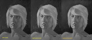
also, unless you've calibrated your monitor, it's probably too light. if you're using a public computer, this is almost always the case. generally speaking: your 'brightness' level should be somewhere around 50-60%, while your 'contrast level' should probably be somewhere between 60-90%. in a dark room, a swatch of black should look black, not dark gray, and white should look white but not be glaring you in the face.
the biggest issue is how muddy things are. lightened it up, and adjusted the lighting of the background to be consistent with the top down set-up on the figure. Tyler has a similar thing going on in his portrait.
this is to mimic really squinting your eyes to see the value relationships. overall the figure is done pretty good in terms of top down. it was lacking a few distinguishing planes, but the biggest issue is the consistency of the hair. the shadow side just wasn't really darker than the light side.
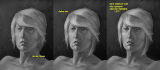
just some refinements in the modeling and details. the biggest issue was the hair. it fell behind the neck, but there was no ear behind the bangs. so i just brought it forward instead of painting in an ear. and always remember catchlights in the eyes, it gives it life. even if there isn't that photographic key light reflecting into the eye, there are those little points that are reflections in the wetness of the eyeball. without them you either have a corpse or a statue.
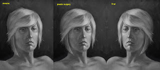
this phase actually should have been done first, when you flip it you can see the issues in the structure much more easily. being that for you this is an actual painting, you need to find a mirror to hold it up into. correct your structure before moving on to anything else.
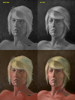
for comparison. and i included the color for kicks, just layed the colors over the modified B/W, you can see the discrepancies in the modifications. didn't modify the color, maybe another time.
Wednesday, July 29, 2009
WIP
Tuesday, July 28, 2009
Thursday, July 23, 2009
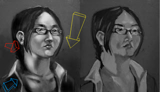
paint over
first let me disclaim that i didn't do this to pick on Vince, but because i always learn a lot from 'paint-overs' (ah the ease of digital), doing them and having mine done. i'm struggling with figure drawing/painting myself and i tend to be blind to my own short-comings, it's always so easy to see those of others! heh, uh... sorry Vince.
no really, it helps me to quantify technique by stepping outside myself. it helps me correct the mistakes i also make in my own images.
i did this as my warm up for the day. just some speedpaint for about an hour. i crunched the original post (on the right) into B&W to really look at values. the problems become more clear.
(i did the lights in '3d' because unless you think of them that way, the forms they describe will never be.)
the YELLOW ARROW, represents the primary light source and the top down relationship it has on the form because it is above the form, also the light source that makes the brightest highlights possible, and what makes the highest specular highlights possible (glasses, eyes).
the BLUE ARROW represents the secondary light source and it's hierarchal relationship to the primary light source. the brightest highlights it creates (the inner neck below the jaw, inner collar) can't be as bright as the brightest highlights created by the primary light source.
the RED ARROW represents depth. i tend to use projected light to this effect because i tend toward dark moody images. the surfaces more toward the front (closest to the viewer) are lighter than those further from the front (shirt collar behind the neck, rear of the head/hair). you could substitute a color shift instead of a light shift to the same effect.
also, never forget shadows (from the glasses onto the cheeks, the neck onto the collar).
anyway, hope this helps somebody somehow. PS, anything of mine is fair game for a 'paint- over.' but i'd really like to hear feedback as well as initiate a new way of helping each other out.
Wednesday, July 22, 2009
Hallway
Tuesday, July 21, 2009
Portrait again
Portraits
Monday, July 20, 2009
fishy
Friday, July 17, 2009
Thursday, July 16, 2009
Watercolor continued...
Here is another watercolor attempt of another resident, who is named Howard. I like this one a lot more than some other attempts in watercolor but I feel like it is "wonky" if that makes sense. I did a solid drawing but the lines got softer and more wiggly with the watercolor. Is that just the nature of watercolor? And I never know what to do in the background.
Tuesday, July 14, 2009
WIP
Monday, July 6, 2009
tweak
thanks all for the comments.
Michelle: took out those redundant captions. it's definitely more for aesthetic purposes in the vein of 'making of,' not a game manual. the other little notes i left, because i feel they convey elements that the drawing doesn't necessarily by itself.
Brandt: good call on the white outlines, they are somewhat of crutch for me. i employed some lighting elements instead to maintain the separation of the objects vs the background.
Alyssa: i would totally agree with you if this piece were about the character. hopefully the silhouettes of the weapons further illustrate the interchangeability of the handles of the weapons as well as being enough to down-play the character more so.
Tyler: i tried 'crisping' up the facets on the necks of the weapons to lend themselves more to an octagonality. but like you said, because of the size, some of the small elements are less important than the overall design.
Sunday, July 5, 2009
Help, please
I've been thinking about doing some portraits in watercolor but I thought I'd try it out on myself first. I don't really like this first painting but I think I learned a lot while doing it and can do better next time. Firstly, I know there are drawing problems, but not entirely sure what they are so some comments on that would be good. Also any comments on watercolor technique would help since I'm not that experienced with them. I liked the painting in earlier stages of it and I am hitting myself for not taking photographs for you, but I always forget. I think a big problem is the color. It was really beautiful in the first layer but then got all muddied up. I think I need to wait for layers to dry, right? And then you can do some glazing and what not?
I am also the queen of bad light sources so I used an overhead light which is why the shadows on my chin are so dark and I had a hard time making them not look like a beard. And why does my neck seem to be coming forward? I fixed it a little bit but it still bugs me.
I think I need to keep in more simple too because do you see that one brush stroke on my hair in the upper left corner? That was just one stroke and I absolutely love it. I wished the rest of the painting looked like that. I also like how I left the highlights on the hair just white because it creates interesting negative shapes. Should I do that in some of the face? K I just wanted to let you know my thoughts so you can agree or disagree. thanks.
Saturday, July 4, 2009
Friday, July 3, 2009
Last In Line
There's no shadow under her, I know. The little stinker's given me quite a bit of trouble. I can't decide what to do with the background...everything I've tried looks wrong. You can probably see after-images of previous background attempts beneath the gesso. Any ideas? To be honest, I kind of like having her enveloped in the same color...even putting a shadow beneath her looks a little worse than with no shadow at all.
Thursday, July 2, 2009
Golden Girls (that's not the name of the piece because that would be lame, it's just the name of the blog post)
So it's nearly done. I want to glaze the background (probably just the cupboards and onto the left side, not the close wall behind Maurine) because I want it to get pushed back. I feel like it's competing with the foreground, especially the lamp. I feel like the lamp does not stand out like it should since it's the light source. I've never really glazed a big area before, so any suggestions would be good. I was thinking of glazing it blue because there is also light coming from a window on the left/front. Oh and how long should I wait to glaze? I painted the background just earlier this week.
I also don't have a reference for Maurine's right (our left) arm so I just made it up which never works for me, so any comments on making that work would be nice. For any other comments you can refer back to the original photograph from my first post if you'd like, but I'd prefer that we talk about the painting and how it stands by itself.
Another attempt
So I wanted to try out watercolor for this one and I might try oil on the follow up or prismacolor. I guess what I'm looking for is some feedback on how the look of glass is working out. I've never tried painting something so transparent. Any suggestions there? I'm thinking of not using a direct light either, to possibly capture other images reflected in the glass like Geoff suggested earlier. I know there are a couple drawing problems I could address but alas w/ watercolor there's no going back. So the top one is the finished piece with in progress pics below. I'm also considering painting these in a shadow box, on a window sill and on an old piece of wood where they would screw on.
Painting
Since I have the problem of having a MFA in painting and can't paint, I thought I would try to learn how for a while. Nothing much to the process, just raw umber ground and drawing, then pretty much from one side to the other. Went back and glazed a couple shadows back. My pallette was simple: venetian red, yellow ochre, payne's gray, raw umber, burnt umber, and van dyke brown. Oh, and white. Bottom one was photo'd with cloud cover, so it's not as saturated.
weapons
So I know this might be a little out of sync, but it's what I've been working on. The majority of the art I do is 'concept art,' very illustrative and at the opposite end of the spectrum from the expressive art we are more familiar with. I have pages and pages of this kind of stuff, little vignettes of an item, some kind of vehicle, or a piece of architecture. The kind of stuff you would see in a 'making-of' type of book about a movie or video game.
I've tried to utilize color temperature and lighting, texture and spatial relationships. All the standard techniques apply, crit away!
Subscribe to:
Posts (Atom)