Thursday, August 20, 2009

Teddy

Sorry for the short notice, but I need a critique today. I'm submitting this to a show, nothing big, just a local thing. But please comment on color, composition, and the annoyingly empty space in the top right hand corner...and anything else that crosses your mind. Thanks everyone!

And please keep in mind that the whole thing looks SLIGHTLY bluer than the actual painting...courtesy of quick-sloppy photography outside. Tried to photoshop it, but apparently I didn't make enough changes. And as with almost all of my paintings, the background is largely gold gesso.

Oh, and please don't tell me that my teddy looks like a rat. My husband already let me know.

Thursday, July 30, 2009

paint-over 2

per Vince's request.
i saved them out as steps to keep the bla bla bla to a minimum.

another disclaimer, these paintovers are just quick studies, 45 min - an hour. just enough to scrub in some of the biggest issues. it would be pointless to really fine-tune it out as it would just end up being a huge departure from the original instead of making it an object to learn from.
also, unless you've calibrated your monitor, it's probably too light. if you're using a public computer, this is almost always the case. generally speaking: your 'brightness' level should be somewhere around 50-60%, while your 'contrast level' should probably be somewhere between 60-90%. in a dark room, a swatch of black should look black, not dark gray, and white should look white but not be glaring you in the face.

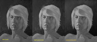
the biggest issue is how muddy things are. lightened it up, and adjusted the lighting of the background to be consistent with the top down set-up on the figure. Tyler has a similar thing going on in his portrait.

this is to mimic really squinting your eyes to see the value relationships. overall the figure is done pretty good in terms of top down. it was lacking a few distinguishing planes, but the biggest issue is the consistency of the hair. the shadow side just wasn't really darker than the light side.

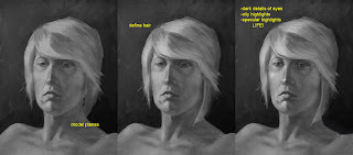
just some refinements in the modeling and details. the biggest issue was the hair. it fell behind the neck, but there was no ear behind the bangs. so i just brought it forward instead of painting in an ear. and always remember catchlights in the eyes, it gives it life. even if there isn't that photographic key light reflecting into the eye, there are those little points that are reflections in the wetness of the eyeball. without them you either have a corpse or a statue.

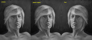
this phase actually should have been done first, when you flip it you can see the issues in the structure much more easily. being that for you this is an actual painting, you need to find a mirror to hold it up into. correct your structure before moving on to anything else.

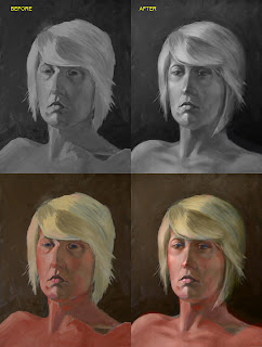
for comparison. and i included the color for kicks, just layed the colors over the modified B/W, you can see the discrepancies in the modifications. didn't modify the color, maybe another time.

Wednesday, July 29, 2009

WIP

sketch i did the other day, thinking about doing up a digital painting on it.
the actual sketch is on the right, and my value comp is on the left. any input on the composition or anything?
my wife gave it the title of 'Who dares disturb my slumber?!' i love fun fantasy cliche stuff like this.

Tuesday, July 28, 2009

Not done yet


the female took 6 hours,the male took three hours. jeff do you b&w paint over on these i want to see what u get. Any corections visible on my skull comp?

Thursday, July 23, 2009

paint over

first let me disclaim that i didn't do this to pick on Vince, but because i always learn a lot from 'paint-overs' (ah the ease of digital), doing them and having mine done. i'm struggling with figure drawing/painting myself and i tend to be blind to my own short-comings, it's always so easy to see those of others! heh, uh... sorry Vince.
no really, it helps me to quantify technique by stepping outside myself. it helps me correct the mistakes i also make in my own images.

i did this as my warm up for the day. just some speedpaint for about an hour. i crunched the original post (on the right) into B&W to really look at values. the problems become more clear.

(i did the lights in '3d' because unless you think of them that way, the forms they describe will never be.)
the YELLOW ARROW, represents the primary light source and the top down relationship it has on the form because it is above the form, also the light source that makes the brightest highlights possible, and what makes the highest specular highlights possible (glasses, eyes).

the BLUE ARROW represents the secondary light source and it's hierarchal relationship to the primary light source. the brightest highlights it creates (the inner neck below the jaw, inner collar) can't be as bright as the brightest highlights created by the primary light source.

the RED ARROW represents depth. i tend to use projected light to this effect because i tend toward dark moody images. the surfaces more toward the front (closest to the viewer) are lighter than those further from the front (shirt collar behind the neck, rear of the head/hair). you could substitute a color shift instead of a light shift to the same effect.

also, never forget shadows (from the glasses onto the cheeks, the neck onto the collar).

anyway, hope this helps somebody somehow. PS, anything of mine is fair game for a 'paint- over.' but i'd really like to hear feedback as well as initiate a new way of helping each other out.

Wednesday, July 22, 2009

Hallway


Any advice before I start painting will be appreciated. I am leaving for a week next week so I'm not sure when it will be done but I'll post it when it is.