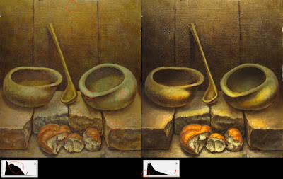
of course there are the standard contrast and saturation fixes, but I noticed there were some more subtleties necessary for the solution.
1-the biggest issue isn't necessarily just making the darks darker and the lights lighter. if you look at the histograms of each image you'll notice that the paint-over's darks aren't darker than the original's darks. there are actually less of them! you just need to maximize how you use contrasting edges to make some things sharp and others soft, and create the illusion of darkness.
2-the same is kinda happening with the lights. of course there are a lot more lighter values, shifting the bulk of that hump of midtones (in the histogram) and spreading them out to utilize a bigger range of lighter values; but the biggest issue was light hierarchy. in the original I circled the lightest value, but it's used all over the place. there isn't a 'highest' value to focus on. in the paint-over the highest value is on that upper lip of white bread. with this lighting setup I figured a center-out dynamic would help as well. so what you get is a hierarchy of highlights getting darker as 1-they are further away from the light source (the floor below the bread), 2-they are further from the center of the light source (the bricks to the side of the bread, but not further from the light source), 3- they are further away from the viewer (the lips of the bowls, but are closer to the light source than the corners of the bricks and the bread).
i think there are big issues with the composition that could only be remedied by starting over, but otherwise, pumping the light and saturation makes it a fairly interesting image.
hope that helps!

2 comments:
Those damn histograms are hard for me to read.
First, you're right about the lighting and the comp in general. I guess I wanted feedback on the sensibility of the paint, the palette, temperature of the shadows, and so on. Have anything to say about that?
And as always, thanks for the paint-over.
As for the histograms:
The easiest way to read them is to think of them like an inventory of paint on the paper, how much of what you've got. Not that it helps you while you're painting, but if you get stuck you can take a picture and 'crunch the numbers' to suggest what you should try next.
As for the sensibility of the paint and palette, I think that's the least of your worries. If you don't nail the other things, they won't matter anyway, they can't save it.
But I guess you could consider saturation of color, and value of color as part of the palette. So yeah refer to the histogram for what you need to include, ha.
Post a Comment