Monday, June 29, 2009

practice

i've decided to start doing plein air painting around Salt Lake. i love the juxtiposition of wide-open land and urban architecture. these are acrylic, and about 45-50 min ea. i'm going acrylic because i hate the hassle of oil, and i really struggle with the 'wetness' of oil if you want to lay it all down in a hurry. and i use a lot of medium in my quickly drying colors because i prefer to overlay colors with varying levels of opacity rather than mix wet in wet, (although, i'm trying to utilize both techniques, oils are a bit too 'slippery' for me).
i did the night one first (first plein air ever!). and then the day one was the next day, same location. i ended up doing a little dodge/burn on them after scanning them in. and the day image was so super loose and lacking necessary elements, that i went ahead and combined it with a photo i took of the same spot, for a multi-media kind of approach.
at any length, the digital alterations are so handy and versatile as a learning tool, that i've had a lot of success 'exporting' those skills back into the paint. just part of the education i guess.
anyone have any palette knife painting tips/references?

Monday, June 22, 2009

Assessment and Next Post - Date extension

Okay guys.  First round is done.  Any of you can email Brandt or me if you have any questions or concerns/complaints about the blog so far.  If you wish to voice them to everyone, please comment on this post.

This was sort of a trial run, just to see what each other are working on.  Next post will be a finished new piece.  Remember also that it is a process post, so take a few photos in mid stages.

I originally had the date for next Tuesday the 30th.  That seems short, so lets extend it to Thursday, July 2nd.

Friday, June 19, 2009

technique

Alyssa brought up mixing a little bit of a core color into every color of a painting to keep things consistent and harmonized. Great advice!
Some of you may know Matt Larsen, anyway, a few years back he went to one of Jeremy Lipking's workshops, and that was one of the techniques he utilized. Check out some of his amazing work to see this in action.
-his blog
-his gallery

If you're painting in oil, some people achieve the same final effect by running a light glaze of the core color over everything as a final or near-final touch.

*in PS it's just a matter of adding a 'color' type layer of the core color on top of everything and reducing it to a low opacity

Thursday, June 18, 2009

steamstalk concept

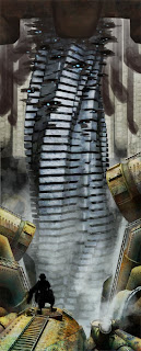
i did a quick little mock-up implementing some of the ideas i received.
-lightened up the 'roof' a bit
-more pipes and stuff on the inside of the space around the upper beanstalk
-toned down the amount of water to make more 'deep' space viewable
-and my ideas for the 'leaves' and the position of Jack

i think it's stronger already, good call guys.

this is essentially the design for Jack, though like the mock-up you're looking at his rear and a some what back-lit dark silhouette. he's being 'modeled' by someone else, so i have yet to get hold of 3D asset to put into the scene.

Tuesday, June 16, 2009

Jane's A Struggle


Disclaimer: This is my first time using blogger so I uploaded the pics all backwards.

Some of you already know I work at an assisted living home and I've been doing portraits of the residents for a summer project. Here is a big one I've been working on (40"x48"). I've included the original image so you can see that I've had to move the figures for compositional reasons but then I've also had to figure out some of the lighting since I've placed the lamp a little bit higher and moved the woman on the right much closer to the lamp. How does the lighting look to you folks?
Bonus question: Does anyone know why one of these portraits is working better than the other? I really like Maurine's face (she is on the left in the painting, and on the right above on the close up shots) but I don't like Jane's face so much. I think it's because the light is hitting her face straight on so there's not much dimension and a lot of symmetry. I'm wondering if you have any suggestions to make her face work as well as Maurine's.

Small beginning...


So here you have my little beginning of an idea I plan on looking into. These are glass insulators that used to adorn power poles everywhere. My dad collects them. This was a basic value study and I plan on doing a few more of these and then turning them into paintings with several insulators displayed horizontally. I am planning to try both oil and watercolor and possibly prismacolor. I will light them with a strong spotlight to increase the intense colors of the glass. I know there isn't a lot to go on here. I will get more on here soon.


Okay, so this is obviously a work in progress. All I've done is map out the value-composition. The idea behind it is that humanity has become scrunched together (yes, scrunched is a word in my book) in tightly populated cities, but somehow, we've ended up isolated from each other. More often than not, someone can walk through a busy street without being greet once. Even when walking with friend, getting from point A to point B is sometimes more important than conversing with one another.

The brushwork and overall color scheme is still up in the air. The base-idea was such a lonely one, that I did the underpainting in blue. I've got ideas of how I'm going to go about doing the rest of it...but we'll see when it's finished. I never really know what the finished product will look like.

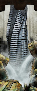
steamstalk

this is for a project i've slowly been working on for a long time. an illustration from the story of 'Jack and the Beanstalk' but in a steampunk setting. in a dark hyper-industrial world, Jack, a hydroponic farmer trades a load of hard-grown greens for a broken pocket-watch with a oak-tree embossed on it's lid. he ends up fixing it up into working order but loses through a grate into the metal abyss below.
this would be a scene of him finding the giant automaton beanstalk.
Jack would be standing on the pipes in the foreground, so yep, it's not quite done, like 90%. and there are leaves with neon lights that i'm working on dressing up the beanstalk with.

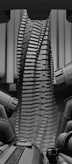
a little bit of process: this was painted in Photoshop over a 3D layout. all digital baby!

and no, the computer doesn't do it all for you. imagine building a set out of clay, then getting the lighting right, then taking a picture of it, then painting over the photo like in a multi-media approach. this process is a lot like that. so far this is about 25-30 hrs worth of work.

Monday, June 15, 2009

Sketchbook Post

These are some ideas I've been kicking around about a mysterious artifact found with an unknown purpose, similar vein to the Antykithera Mechanism or the Bagdad Battery.  I wanted documentation of it in an old journal that was found.


This first image is in graphite, then superimposed over old paper and messed with a little in photoshop.


Another one, quick acrylic sketch.


I thought if I'm creating a forged journal, I ought to take up pen and ink, an activity I've only done in a 2D assignment.  Trying to get textures of a crumbling concrete wall.  I used a fat round pen tip with diluted ink, then a sharp tip with pure black for the sharp lines.  Any tips for ink technique would be great.


Saturday, June 13, 2009

Art opportunities

I don't know if any of you have been to the Utah Arts Council website but it has a lot of resources and information for artists. It's arts.utah.gov and go to "services" and "for artists". I have already requested a newsletter for art oportunities and they also have a lot posted on the website. It looks like they used to have seminars but don't anymore because of budget restrictions (story of our lives) but they have the past seminars on dvd which you can buy for 5 bucks. I'm going to email the chick about it so I'll keep you posted on that.
For those of us who are in Logan, Art of the Lawn is coming up on June 26th. It's an art festival with a show, auction and artists have booths on the lawn. If that sounds kind of vaugue, it's because I've never been before but Erik Olsen has and he told me that its pretty informal. You can just come and set up your own booth. He says no one really buys art but it might be a good opportunity just to meet some art peeps in the community. I can't decide if I want to do a booth or just go check it out. What are your thoughts?

Wednesday, June 10, 2009


this is a value and color comp for a painting im doing. when i add the color the value seems to dissapear any ideas evan if basic would be appreciated. on the advice of tyler i have changed the color of the lit side (right) side of the background to a more neutral color evan though it reads as that purple red to me

Tuesday, June 2, 2009

Schedule

This is a schedule of the required posts.  They will be on Tuesdays:

June 16th, Sketchbook Post:  This post is to establish what you will be working on.  You can do sketchbook drawings, brainstorming sessions, or anything you already have.  A finished piece is not required.

July 2nd (Thursday), Process Post:  Include your finished piece and 2 - 3 images in mid process.  This can be different layers of paint, from sketchbook to finish, any digital enhancements, etc.

July 21, Sketchbook Post

August 11, Process

August 25:  Post any finished work.

Manifesto

Frog Hollow Summer Camp is here to motivate us to keep producing art over the summer months.  This blog is open only to those who are participating.

Every two to three weeks, a mandatory post of work will be required, after which we can all post critiques under the comments section of each post.  Some of these required posts will be content directed, such as a post about your process (see below for details).  You can, however, at any time, post anything you feel pertinent.

In order to keep critiques as useful as possible, their content will be restricted.  Brandt and I devised a few rules:

1.  Critiques will be confined to two topics:
A.  Technique - Useful comments about the application of paint, a better step in process, etc.
B.  Concept - As it pertains to a real world, commercial (yes that's right) application.  Coming up with real world examples, a venue or market for the idea, etc.

2.  Criticism - or praise for that matter - should be given only when useful.  "I like the way you drew that pelvis" is not useful.  Sure, you can say "good job," "you're getting better" and things like that (we're not cold-blooded bastards) but keep on point in your overall message.  

3.  Saying something is not a requirement.  One of the things I hate about critiques is that people feel like they should say something, and so they dig for comments.  Sometimes saying "you're on track - do 3 more" is enough.  Remember a variation of what your mom told you:  If you don't have anything useful to say, don't say anything at all.