i had this HUGE post with a bunch of info but blogger wouldn't accept it. not sure why. i just thought i'd share a few things i've found lately.
http://monalisa.com/ - there is a video that explains what it is, i just registered with it - http://darcibertelsen.monalisa.com/ it seems like it could be real sweet. it's just starting to get it going, i saw somewhere that they're trying to get it all up the first part of this next year.
Plate show at art access, it’s about 100 artist, 300 plates.
.....you just have to email Sheryl Gillilan (sheryl@accessart.org) by January 15th, 2012. If you are a new artist to this event, please include a link to your website or 4-6 images of your work. We will confirm that we have received your email and will make all acceptance notifications no later than January 18, 2012. (Please note that our office will be closed December 22 thru January 2nd.)....
these are websites that list national show - i've been trying to find more places to enter into show in and out of state. you kind of have to dig, but it seem to be an ok resource (for something online)
http://www.artpoints.net/calendar.html
http://artdeadline.com/artman2/publish/opportunities/index.shtml
so that is the short version. if you have questions about any of these things email me, or comment and i'll send you an email with more info or shows i've found that are coming up in the next few weeks/months.
Saturday, December 17, 2011
Monday, December 5, 2011
photography
James Gurney of Dinotopia fame has a really good post about photographing your paintings. A budget solution without an intense lighting setup. HERE
Monday, November 7, 2011
oil sketch
So I painted up this thing tonight, based on some tweaks Geoff suggested. I used cerulean blue, burnt sienna and white, for a warm/cool effect. I thought it was interesting the mixture of the two had a green tinge - wouldn't violet be more towards the mark?

Anyway, this is gessoed butcher paper, about 10 x 18 or so. I have five more for other studies. So far, I'm digging where this is going.
Sunday, November 6, 2011

Saturday, November 5, 2011
Swamp Thumb
Some sketches for a painting request for my mom. Some of the elements: elongated ratio, eroded roots, and an Alexis Rockman style cross-section of the water.
Any of these getting anywhere?

Friday, October 21, 2011
Magic Circle
Man, it's hard to get the colors right on blogger.
This is a little 9x7. I really like working in this size. The last one I posted is still in progress, and not going extremely well, though I've figured one thing is clear: I really like working right on the wood. This one is just the panel with several layers on polyurethane. I really liked working on this one and I think its the biggest success I've had in paint in a while.

Wednesday, October 19, 2011
snow truck + family

so i'm trying to get the done by saturday for the religious show at springville.... (i was thinking of titling it "isn't it about time" - not really) anyways i'm kind of stuck, i know her face is horrible and i'm having a really hard time figuring it out there is NOTHING in my reference. i'm thinking i need to break some edges quite a bit more to make it more painterly, but every time i do it throws off my perspective more (so i'm thinking i'm having value/saturation issues?) the snow in the front is really blue, and there is a road in the back ground. in real life the road is more pink than what the photo show so the 2 stripes of color in the snow aren't the same color. i think that might be the biggest part of my perspective issues. any ideas how to fix that?
when it get's a little further i'm going to glaze it all so it's a little pinker/warmer. and i'm trying to find places where i can add some line work/accents. do you think the bed of the trk is too dark? or warm?
give me anything please.

this is just a little 5x5 and way blurry i don't know why i'm having such a hard time taking a photo of it. it's just similar so i thought it might be good to post with the other one. i was making this one too saturated, and i don't know if i've desaturated it enough or gone too far.
Sunday, October 2, 2011
artist folder
dear everyone,
i've told a lot of you, but i'm not sure if i've told everyone so i'll explain.
the past 2 ish years i've been collecting images of artists. it started because really, who can afford all the art books you want, and i was tired of looking up/trying to remember the same images over and over again so i decided to start saving them. it's now huge and i thought i should share. it consists of artists who have stood out/influenced me for one reason or another. some of them are people i really don't like their work at all, (because sometimes you can learn just as much from work that seems a little off.)
i was thinking if you want to add to it and share you could keep a separate place (so i don’t have to sort through what’s new and what’s old) where you add any additional info to the folder and send it back to me, i could consolidate all the new information everyone has added and re- distribute.
long story short, if you want to leave me your address i'll mail you a copy.

Wednesday, September 28, 2011
The Ancient Dragon Defends Her Last Egg
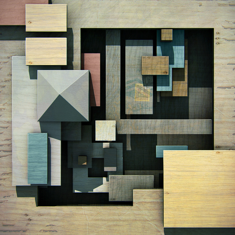
So I made a new discovery: Drawing on bare wood is a blast. I may never go back to paper.

This is going to be a beat-up piece in experimenting on a new process for the Wunderkammer series. I love the wood grain so much, I want to try to varnish the drawing and oil paint right onto the wood, acting more like a stain than opaque paint. And I think it would add to the dated feel. I'm not sure exactly what's going to happen, so I wanted to get a pic before I started (I know a lot of the white will go away; hopefully to be rectified in paint). Anyway, what'ya think?
Monday, September 12, 2011
Michelle's new work


A Little Bit O'This

Holy cow. I think I lost a thousand percent of my color when I uploaded this onto blogger. Anyhow, this is my first painting back from my year-long pregnancy hiatus. I don't know what was wrong with me. I couldn't paint. Made me nauseous. Tear it apart, please. I'd love to hear your most critical feedback. Thanks!
Saturday, September 10, 2011
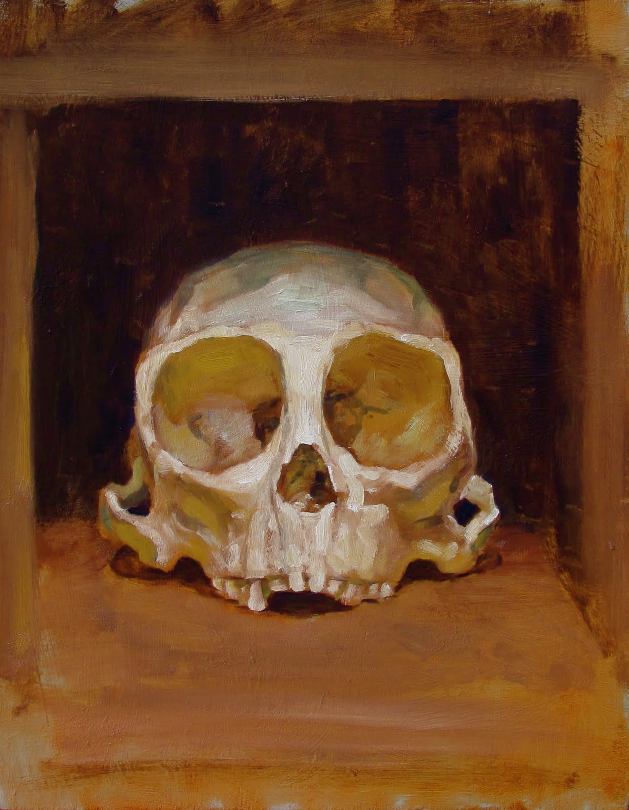
Little Dump
I haven't painted at all since Summerfest, so I grabbed a panel and dove into this monkey skull. This is a few hours, alla prima. It's sort of in preparation for a series of Wunderkammer paintings I've had my mind on for a while. I tried to be a little more interpretive than observational. One panel at a time, right?

Thursday, September 8, 2011
Friday, July 29, 2011
Portrait Studies
This one I did the underpainting for while at my booth at Summerfest. I took it home and finished it later.


2D/3D abstraction
the other day Vince inspired me to do some experimenting based on the kind of stuff he's been working on. so I thought I'd give it a go with my digital tricks.
what if this were a real painting?

Saturday, July 16, 2011
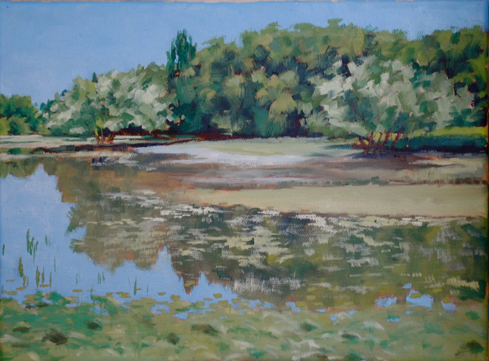
plein air


I can't decide if these are done. the top one the green at the bottom is sage brush, i was planning on putting more info but i don't know if it will be more busy/distracting that way. there is also a fence line at the edge of the sage and field i was planning on putting in, and maybe a little more detail in the trees. . . ?
the other one was right before a storm, i had the sky and mountain painted completely different at first, then it got stormy so i changed it right before we left. i have a picture and there is a little detain in the mountain on the left side, and there is another house in the middle of the trees and white house. i can't decide if i should put it really desaturated and lose in there.
thoughts?
Saturday, July 2, 2011

Monday, May 30, 2011
Latest
Not the best photos here. I ran out and shot these really quick today when I had a moment of sunshine.
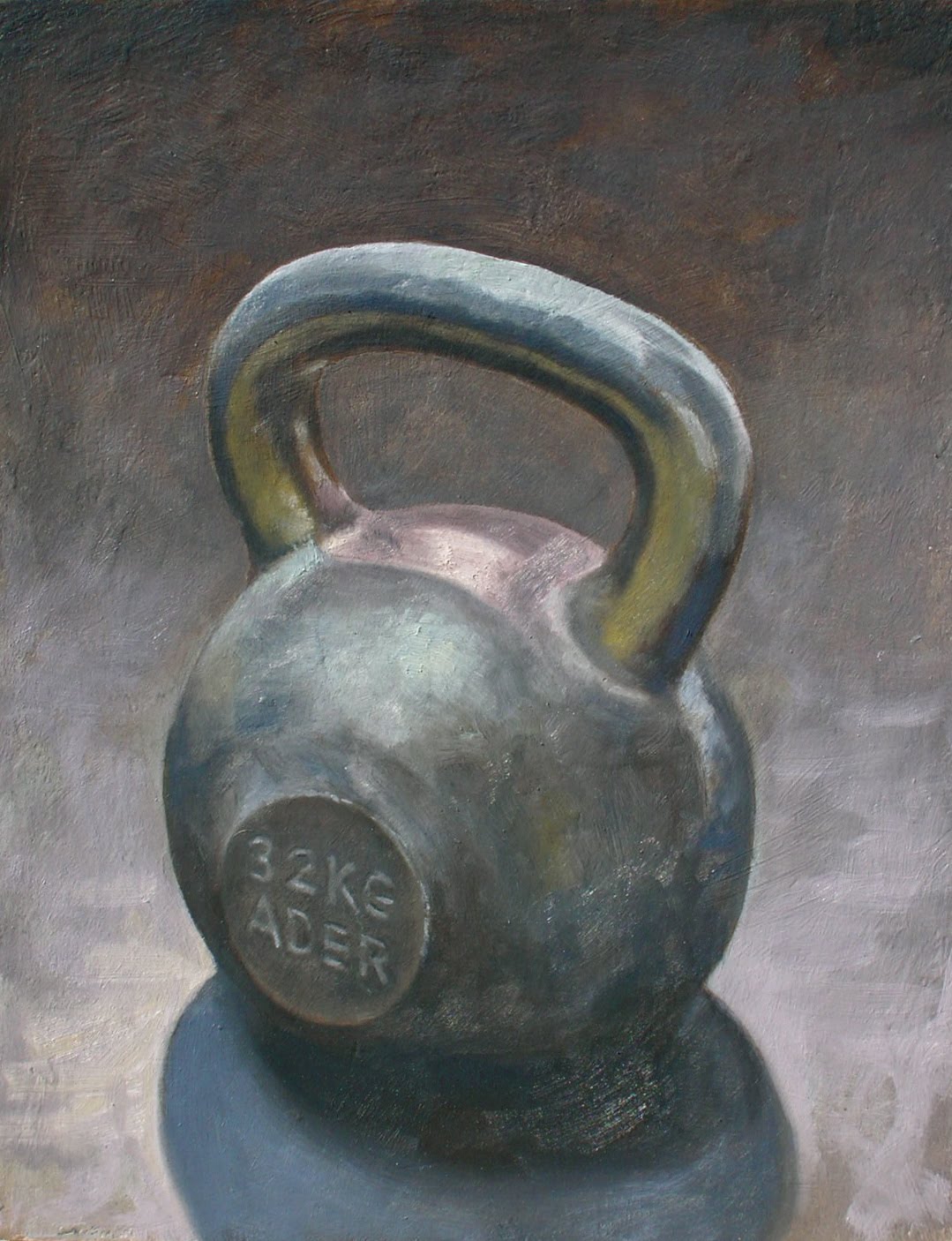
Kettle bell dos. Not much to say, just wanted a companion piece for the other kettle bell.

This one I started a while ago, just before finishing the last one with the bricks and the abstract painting in the background. Another set-and-go, with not much thought to narrative. With this one, I started with the intent of casting out any textural concerns, just paying attention to shape of color, as you can see with the cloth. As the painting tediously moved on, I lost interest, and was unable (or unwilling) to maintain that language, moving back to the way I usually paint - from the glass downward. I don't like this painting, mainly because of the experience I had with it.

There you go.
Thursday, May 19, 2011

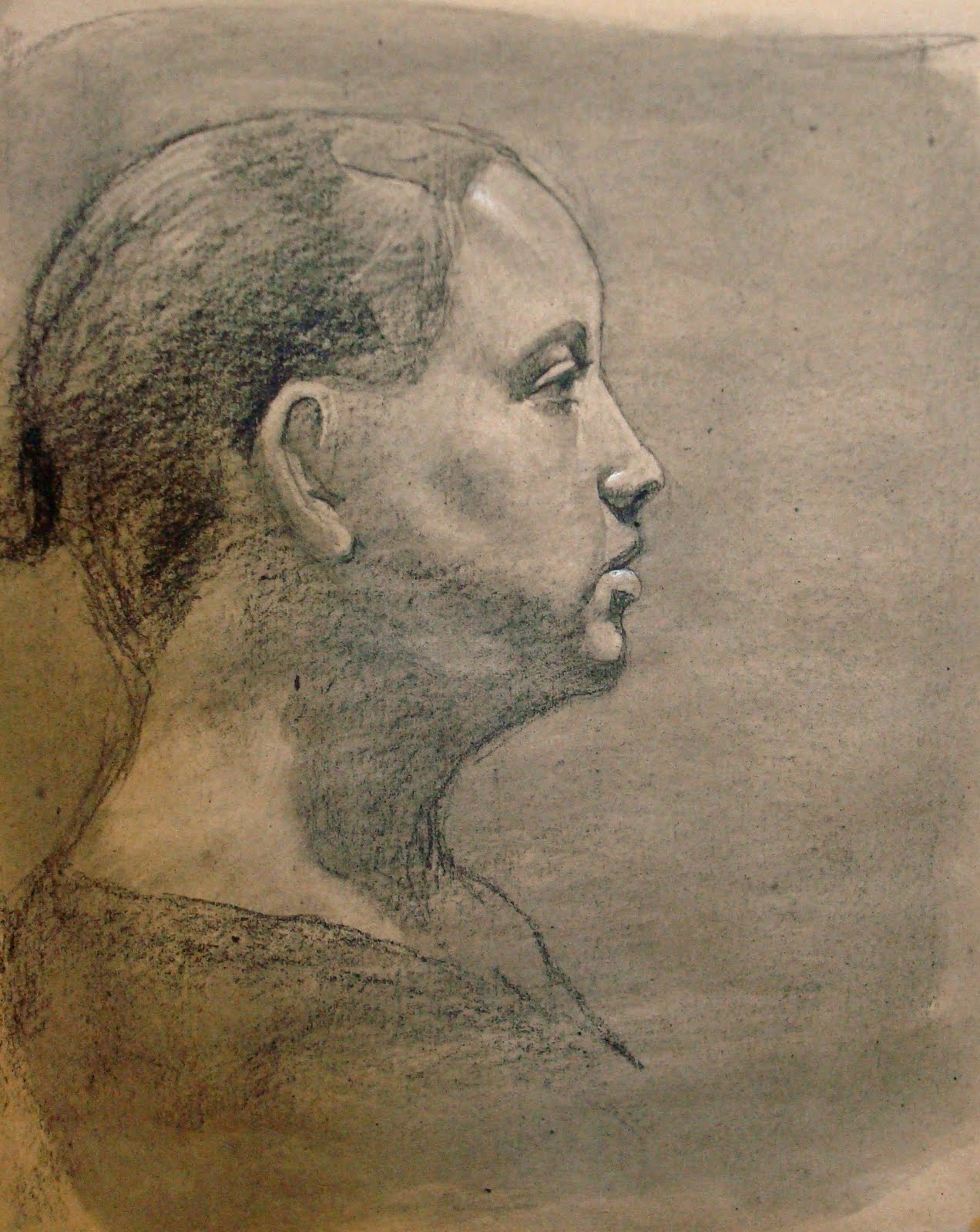
Qwikie
 Taking a cue from Geoff, I wanted to do a quick character sketch to build my chops. This was a little over 2 hours. I used just burnt umber and burnt sienna; I got the idea after watching a Rob Liberace grisaille sketch.
Tuesday, May 17, 2011
Still Life with Abstract Patinting

I put aside any narrative pretension and just set stuff up to paint. I'm continuing with the egg shell thing (I think I'm getting better at them) and may do another one of these. As some of you know, Steven Stradley used to be in my old studio; the backdrop is one of his old paintings he left behind.
How does it read?
Saturday, May 14, 2011
The Finished Product
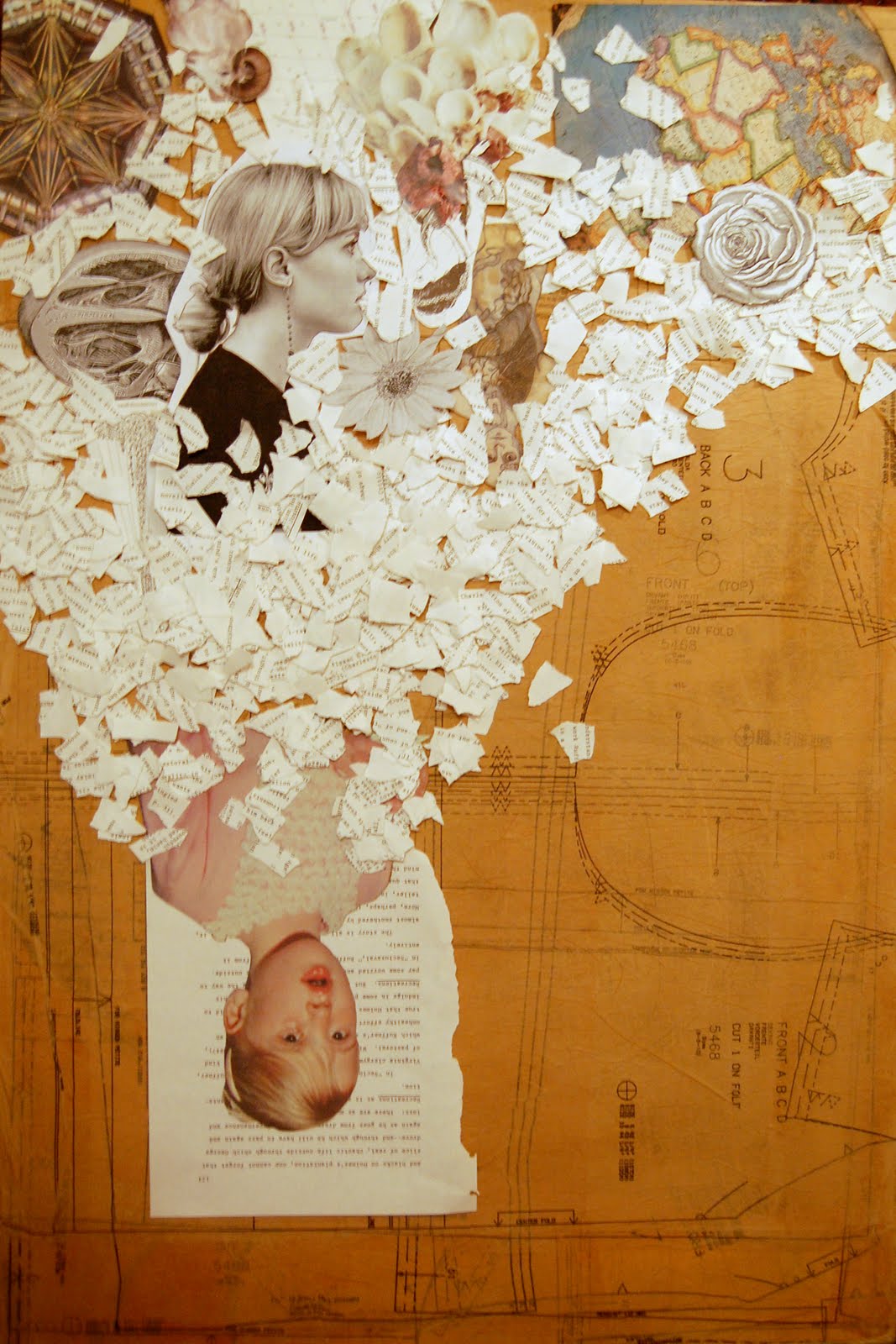
 This is the finished product. Tyler, I agree with your comments on hierarchy, but a lot of this was already glued down by the time I read your comment (you know I'm impatient). However, I think I have created a main focal point and overall solid comp. I realized that I was creating kind of a reflection in earlier stages of this, so I decided to go with that idea. Although it is done, I am open to critique that might be helpful for further collages. P.S. Geoff, I responded to your comment but blogger was down for a day and they were gone when it came back.
Wednesday, May 11, 2011
Last Night's Experiments


So I think everyone on here is caught up with my recent collage work except for Geoff, so if you would like to see what I've been doing for the past year, go to www.picasaweb.google.com/michellelarsenart.
These are some possible compositions I was working out last night. I had settled on the one with the girl at the top and all the stuff falling below her, but when I uploaded the pics on my computer, I saw it upside down and thought it was a nice composition, so now I am open to that. I haven't glued anything down yet so I am open to any suggestions. I wish I had some more questions to ask you to direct your feedback, but just tell me what you think.
Wednesday, May 4, 2011
Moonlight Over Ganymede
At least that's what I'm tentatively calling this first one. I started a few of these little 9x12's on impulse, and if I can get it right I might do a few bigger ones. Any criticism is welcome.


Tuesday, April 26, 2011

Thursday, April 21, 2011


Tuesday, April 19, 2011
Breakfast
So I got a booth at Summerfest here in Logan this summer. I wanted to pump out some sellable stuff. I had a bunch of eggshells I wanted to paint; this is what I put together.
The back of the bowl is getting a lot of glare; its value is much lower.

Friday, April 1, 2011

Wednesday, March 30, 2011
Richelieu

UPDATE: I replaced the photo with a better one.
Tuesday, March 29, 2011
"All for One..."
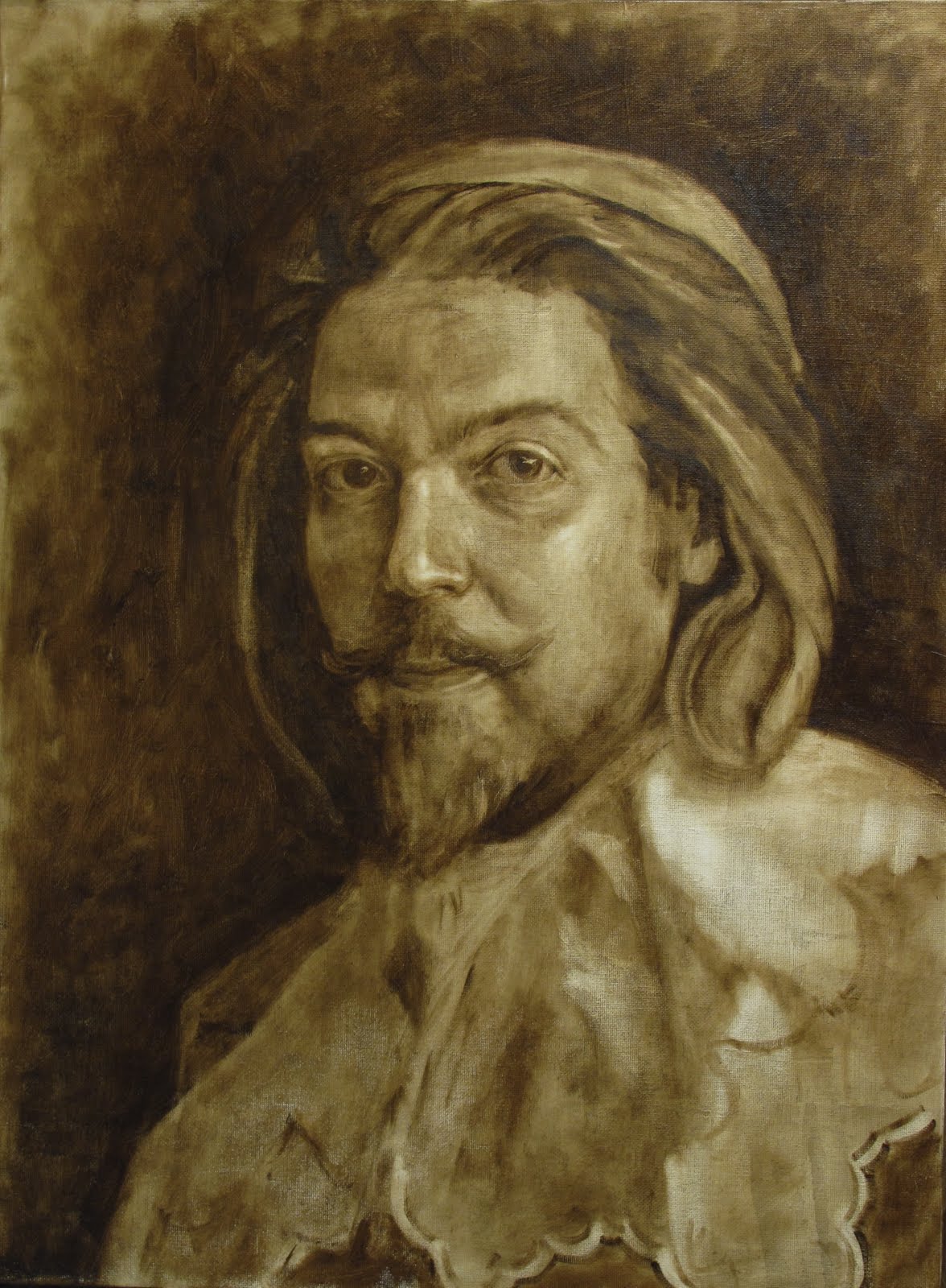
So I'm painting a portrait of Cardinal Richelieu for the theater department's production of "The 3 Musketeers." Apparently there is a scene in which he is painting himself, so I have to leave the painting unfinished. I'm going to start applying color to the face, work my way out, and leave sections just the underpainting.
Friday, March 4, 2011

Tuesday, March 1, 2011
Kettle bell
So I got my big bristle filbert out and painted this. It was a fun change from the Lang Nickels. I loaded up a lot more paint and tried to be a little looser. I'm not finished yet, I think I'll use this as a beat-up piece for glazes and scumbles. I'm starting on a companion piece soon, too.
It's got a little glare in the shadow that throws the value off a little.
Monday, February 28, 2011


Sunday, February 27, 2011

Wednesday, February 23, 2011
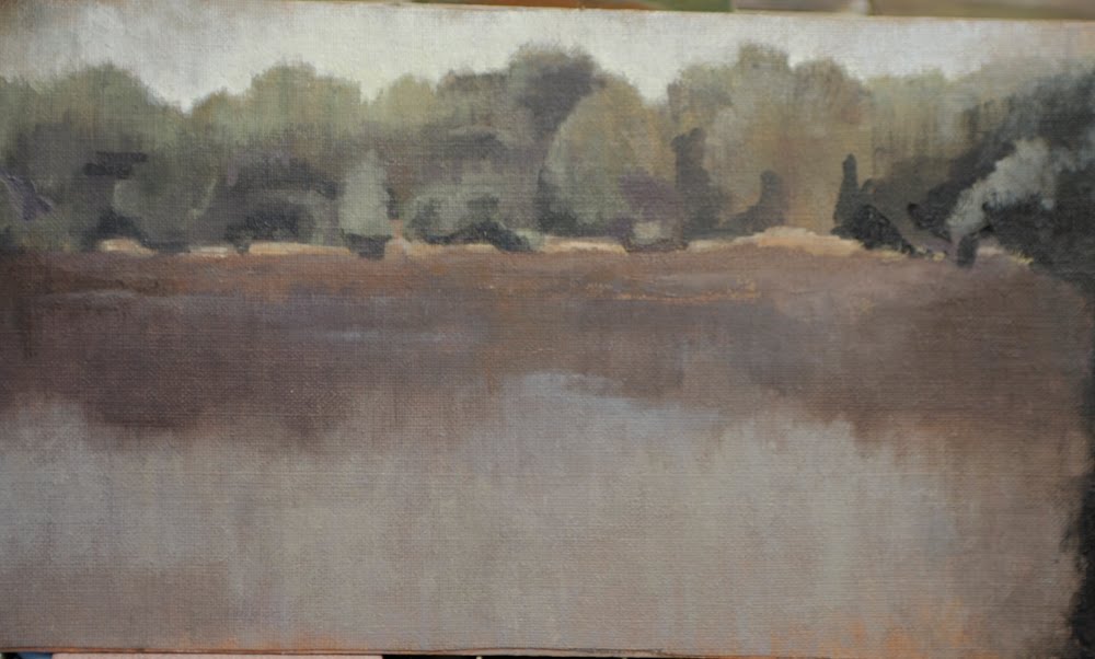
PO
first of all i have to say that i think this one of Tyler's best landscapes. i really like it.
i had some time to play with the image. of course some photographic tweaks are a whole lot easier to pull off than actually painting it up...
*pushing back that upper landmass with a glaze of the water color
*darkening the front landmass with a glaze of that reddish shadow color
*lightening the midground with a glaze of a warm orange/yellow
i skewed the aspect ration to emphasis the horizontal-ness of the image itself

Subscribe to:
Posts (Atom)