Thursday, December 30, 2010

Alright, another paint-over. I tried to break this down to help explain my process.
I think this method will lend itself well to your technique. It seems you should be able to follow these tweaks with glazes. Not that this is a masterful fix or anything, but a quick indication of concepts.
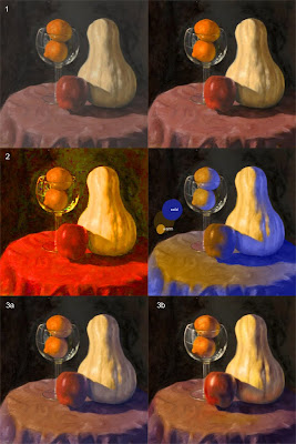
1- I'm assuming the photo is inaccurate on the values because they look a little blah. So the first step was just to push the contrast and saturate things a little.

2- You say you're struggling with temperature on the form. A quick blast of the chroma reveals the big issue: it's all the same color. So I create a color map on top of your values so we can conceptually see how I'm assuming you're modeling the forms, and negate local color entirely.

3a- With that in mind we can simply overlay that understanding of the color over the local color. For the most part the lit space is untouched except for adding a bit of the color of the light source to everything for unity.
The key thing is to create a cooler shadow space. It looks cooler because of the color contrast with the chroma of the lit space. It's a really warm blue, so it's not actually 'cool,' it's just a better recognizable contrast with the lit space.

3b- From that point on the foundation is pretty square so now you can just pump up the money aspects, the reflected light, the speculars, and rich tones. Really keep an eye toward contrast, not only with value, but in contrasting colors against each other. This is why strong reflected lights always sing, because you're reintroducing warm back into cool (in this example), and getting more contrasting colors rather than only where the light terminates.
Also keep in mind that glass needs to really charm. Pump it up for what looks good in the painting even if it departs from reality a little bit.

I've only recently come to appreciate how much chroma is entangled with value. As you represent light with value, the chroma will change as the value changes, you can't just run with a different value of the same color. The reflected lights illustrate this well, but look at the table cloth. As the value across the surface changes so will the color. Really maximize that when you trump up the drama where the light turns to shadow.
Also keep in mind the red of the apple affecting the table cloth without any value change

An isolated comparison for study.

Wednesday, December 29, 2010

Keep Bangin'

So the three image-types I'm going to teach are landscapes, still-lifes, and portraits. My last post, I painted a couple of landscapes; now I'm addressing the still-life problems.

Don't comment on the comp; I know it sucks. What I'm really trying to figure out - what I have a hard time with - is color variation as form turns. I thought the raw umber/ultra blue would address the warm/cool, but I found that my shadow's still weren't warm enough. I ended up adding more cad red to the shadow of the squash and the oranges. Any thoughts on shadow temperature?

I also didn't start with white on the palette. In an effort to unify a light source, I mixed a warm, dumbed-down white to use for highlights and such. I'm not sure if it made a difference at all. Perhaps you guys would know better how to unify with a light source.

I had a heck of a time photographing this thing. Some of the background dried faster than others and went chalky. It's also a little fuzzy; for the choice of photographs I had, I thought I would sacrifice some crispness for the sake of truer color richness.

I need useful things for teaching. Shadow temperatures? Unifying the palette? Anything else?

Tuesday, December 21, 2010

New paintings

First, where the hell is everybody?!?! Come on People! We need posts here, besides Geoff and I, and Brandt.

So, I'm teaching Painting I this spring, so I scraped the palette, dug the solvent out of storage, and bought a few new brushes so I can start the process of endless frustration that is painting.

I'm using the same palette as my students: cad red, cad yellow, ultramarine blue, and raw umber. And titanium white. I like controlling shadow temperatures by shifting from umber to blue.

And speaking of, I painted this one first, a standard photo from the top of the Zugspitze. I entirely used umber, blue and white, and I think I still got a good range of color. I started with an underpainting wash, but used both colors, so I could control temperature from the get go. I also altered the snow so that the lightest value would be that spot just before the deep shadow, to create a focal point.


This next one had a shorter duration but was much harder. I wanted a sort of alla prima approach, so I had no underpainting, just a blue field. I have a much easier time with an identifiable form, and in dealing with just shapes of value and temperature, I get lost. The chroma is a little stronger than in the photo, I had a hard time getting it.


I plan on pumping out a few more over the break; maybe I'll post them.

Thursday, December 16, 2010

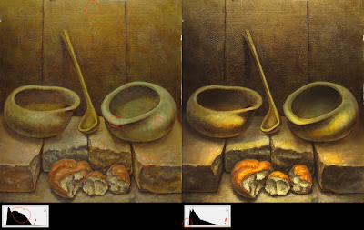
here's another paint-over to help get the ball rolling.

of course there are the standard contrast and saturation fixes, but I noticed there were some more subtleties necessary for the solution.

1-the biggest issue isn't necessarily just making the darks darker and the lights lighter. if you look at the histograms of each image you'll notice that the paint-over's darks aren't darker than the original's darks. there are actually less of them! you just need to maximize how you use contrasting edges to make some things sharp and others soft, and create the illusion of darkness.

2-the same is kinda happening with the lights. of course there are a lot more lighter values, shifting the bulk of that hump of midtones (in the histogram) and spreading them out to utilize a bigger range of lighter values; but the biggest issue was light hierarchy. in the original I circled the lightest value, but it's used all over the place. there isn't a 'highest' value to focus on. in the paint-over the highest value is on that upper lip of white bread. with this lighting setup I figured a center-out dynamic would help as well. so what you get is a hierarchy of highlights getting darker as 1-they are further away from the light source (the floor below the bread), 2-they are further from the center of the light source (the bricks to the side of the bread, but not further from the light source), 3- they are further away from the viewer (the lips of the bowls, but are closer to the light source than the corners of the bricks and the bread).

i think there are big issues with the composition that could only be remedied by starting over, but otherwise, pumping the light and saturation makes it a fairly interesting image.

hope that helps!


Tuesday, December 14, 2010

Old painting

Ok, so I pulled this thing out of garage. It's unfinished, painted while I was struggling in grad school. It was so poorly received that I gave up on this angle.


Not the greatest painting in the world, I know. But in retrospect, there are moments happening here that I really like, and I want to rekindle.

It was basically painted on textured paper, tinted with yellow (questionable move), and completely drawn with burnt sienna. I completely drew the whole thing again lightly with sap green. From there, I glazed on local color, and painted the rest opaquely. I think if I push in this direction more, and play around with shadow temperature and the general washed-out look, I think I could get somewhere. I wanted to get everyone's opinion.

D&D

finished with my dungeon piece. i think it turned out decent enough. the first time I've taken an entire illustration to this level.

you can check out the rest of the entries HERE

Saturday, December 11, 2010

I think it needs more contrast. The easiest 'zing' at this point would be some drama. It would help give it a focal area as well. Here's a quick 15min photo-manipulation of pushing the contrast and adding some texture to the back wall.

The texture on the wall would push the fabric forward via a contrasting texture, instead of being smooth on smooth Some stronger lighting would guide your eye to the upper surface of where the cloth drapes over the brick's corner. Here I've only raised the forward highlights just a bit, darkened the mid-tones of the background, and punched the foreground shadows to get a more contrast driven 'pop.'

Sunday, December 5, 2010

Drawing, WIP?


Okay, I need everyone's opinion on this one. Without a complete redo, how can I put some zing into this rather boring drawing? Contrast is a little stronger than the photo.

Saturday, December 4, 2010


Here are the four latest paintings I've done. I'm working on a companion piece for the top one. I'll post it soon.