Saturday, January 29, 2011

Monday, January 24, 2011

Tuesday, January 11, 2011

Plastic Surgery?

I swear the saturation drops when it posts to Blogger.


So, this is me trying to be quick and get to a point where I can demo this Thursday and explain my way through it.

With the underpainting, I did initial blocking with my 1" flat and raw umber. I then mixed in some cad red, and went darker and a little tighter with the smaller flat. I really liked the temperature shift that created, and while a lot of it will be painted over, it added a layer to help with the fluctuations.

I did that damn squash again. The shadow this time went too purpley, to I had to go in again and knock it a little green. Anyway I'm digging it so far.

Sunday, January 9, 2011

Barber Shop Fin


I was in the zone last night, so I finished it up. I added the shaving cream today; that was Shanell's insistence.

There is some glare on the left side; you can see more brushstroke than what's there. It looks ok, but I think without the glare it looks better.

I was really trying to experiment with shadow temperature on the cloth; tell me what you guys think.

Wednesday, January 5, 2011

Barber Shop

Okay, change of approach for me. This was kind of a last minute set up, and I got my big flat brushes and went to town.

It's still in mid-progress, but I wanted to get some ideas. I really like the similar-valued atmosphere - some parts of the subject loses edges into the background; I like that. But I can't leave the background as is. I want to add a little variation and the indication of light and space, without changing it too much and losing the interaction. Ideas? (I don't like the dark paint I put down just behind the shadow edge of the cup.)

Shanell pointed out a few things. I like the eye-level view, but it creates some small spatial problems. Where the cup handle, bottle and razor all interact, the shallow space flattens them all together. I know there are some foreshortening issues with the blade; its shadow on the cup doesn't wrap around enough and the blade itself gets fatter as it goes back in space. I think I can fix that, but anything else as far as this space goes?

Also, what to do about the ground plane. I haven't figured it out yet. Shanell was thinking the top of some book shelves, where you see the top board and then the recessed space underneath. Sounds like a good idea. Any other ideas?

Thursday, December 30, 2010

Alright, another paint-over. I tried to break this down to help explain my process.
I think this method will lend itself well to your technique. It seems you should be able to follow these tweaks with glazes. Not that this is a masterful fix or anything, but a quick indication of concepts.
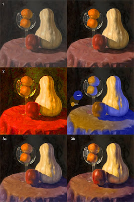
1- I'm assuming the photo is inaccurate on the values because they look a little blah. So the first step was just to push the contrast and saturate things a little.

2- You say you're struggling with temperature on the form. A quick blast of the chroma reveals the big issue: it's all the same color. So I create a color map on top of your values so we can conceptually see how I'm assuming you're modeling the forms, and negate local color entirely.

3a- With that in mind we can simply overlay that understanding of the color over the local color. For the most part the lit space is untouched except for adding a bit of the color of the light source to everything for unity.
The key thing is to create a cooler shadow space. It looks cooler because of the color contrast with the chroma of the lit space. It's a really warm blue, so it's not actually 'cool,' it's just a better recognizable contrast with the lit space.

3b- From that point on the foundation is pretty square so now you can just pump up the money aspects, the reflected light, the speculars, and rich tones. Really keep an eye toward contrast, not only with value, but in contrasting colors against each other. This is why strong reflected lights always sing, because you're reintroducing warm back into cool (in this example), and getting more contrasting colors rather than only where the light terminates.
Also keep in mind that glass needs to really charm. Pump it up for what looks good in the painting even if it departs from reality a little bit.

I've only recently come to appreciate how much chroma is entangled with value. As you represent light with value, the chroma will change as the value changes, you can't just run with a different value of the same color. The reflected lights illustrate this well, but look at the table cloth. As the value across the surface changes so will the color. Really maximize that when you trump up the drama where the light turns to shadow.
Also keep in mind the red of the apple affecting the table cloth without any value change

An isolated comparison for study.

Wednesday, December 29, 2010

Keep Bangin'

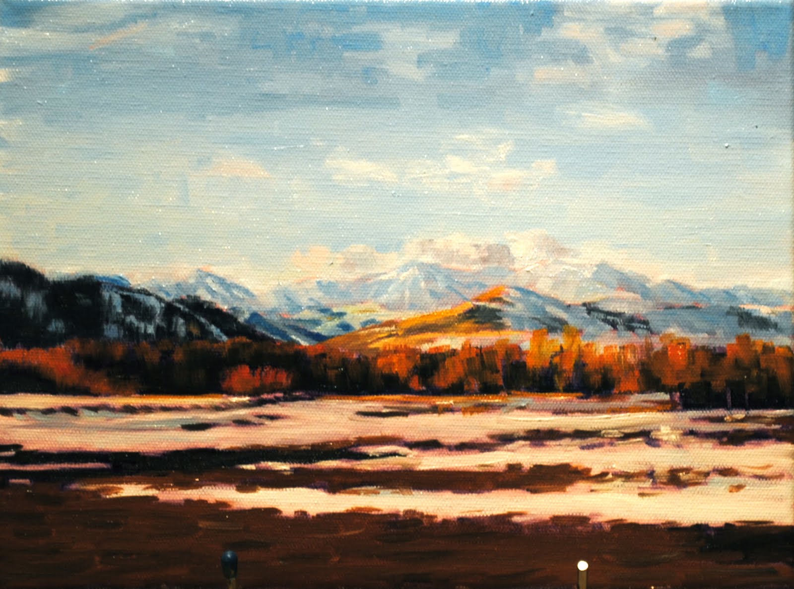
So the three image-types I'm going to teach are landscapes, still-lifes, and portraits. My last post, I painted a couple of landscapes; now I'm addressing the still-life problems.

Don't comment on the comp; I know it sucks. What I'm really trying to figure out - what I have a hard time with - is color variation as form turns. I thought the raw umber/ultra blue would address the warm/cool, but I found that my shadow's still weren't warm enough. I ended up adding more cad red to the shadow of the squash and the oranges. Any thoughts on shadow temperature?

I also didn't start with white on the palette. In an effort to unify a light source, I mixed a warm, dumbed-down white to use for highlights and such. I'm not sure if it made a difference at all. Perhaps you guys would know better how to unify with a light source.

I had a heck of a time photographing this thing. Some of the background dried faster than others and went chalky. It's also a little fuzzy; for the choice of photographs I had, I thought I would sacrifice some crispness for the sake of truer color richness.

I need useful things for teaching. Shadow temperatures? Unifying the palette? Anything else?